What’s new in WCAG 2.2?
This post was updated on August 11, 2023.
We get questions on a daily basis about 2.2 so we asked our WCAG expert Alaina Birney, CPWA, to discuss the upcoming changes. We’ve included her detailed notes below.
WCAG 2.2 is now available across our suite of tools! Start scanning now or get in touch to plan your next website or application audit.
WCAG 2.2 guidelines are expected to be released by the World Wide Web Consortium’s Website Accessibility Initiative in the near future. They were previously expected for release in 2022, but it looks like the release of new guidelines is finally imminent.
Accessible Web is preparing to update RAMP, Accessible Web Helper, and Accessible Web Academy shortly after new guidelines are officially released.
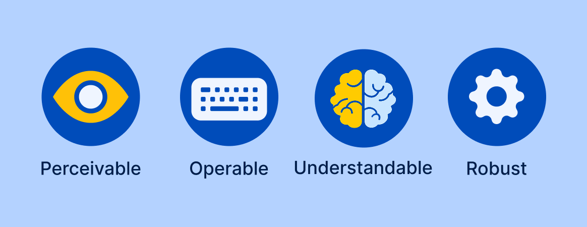
WCAG is a framework designed to improve digital accessibility for people with disabilities. As new technologies come along and existing ones evolve, updates are needed to maintain the success criteria to ensure they help users without being superfluous or outdated.
One such criterion, 4.1.1 Parsing, has been dropped from 2.2 because it’s obsolete. This is because most assistive technology no longer needs to parse HTML directly. Over time, tolerance for HTML parsing errors has improved to the point they are no longer an issue, so the standard is being deprecated.
It makes sense, but it also makes it so 2.2 is no longer fully backward compatible with previous guidelines like 2.1 and 2.0. Typically by adhering to a newer version of WCAG, you could be assured that you were also covering previous versions as well. Not so with 2.2. Since it doesn’t include parsing, a product could conform to 2.2, but technically be out of conformance with 2.1 and 2.0. For these reasons, we still recommend that those striving for conformance with 2.1 or 2.0 continue to test for and remediate issues related to Parsing.
Our own WCAG expert, Alaina Birney, provided her notes on what’s changing in 2.2 that you can review below.
Success Criteria New to WCAG 2.2
- 3.3.8: Accessible Authentication (Minimum) (AA)
- From Understanding Success Criterion 3.3.8: Accessible Authentication (Minimum): “A cognitive function test (such as remembering a password or solving a puzzle) is not required for any step in an authentication process unless that step provides at least one of the following:
- Alternative: Another authentication method that does not rely on a cognitive function test.
- Mechanism: A mechanism is available to assist the user in completing the cognitive function test.
- Object Recognition: The cognitive function test is to recognize objects.
- Personal Content: The cognitive function test is to identify non-text content the user provided to the website.”
- From Understanding Success Criterion 3.3.8: Accessible Authentication (Minimum): “A cognitive function test (such as remembering a password or solving a puzzle) is not required for any step in an authentication process unless that step provides at least one of the following:
Alaina’s strategies for conformance:
- Do not block copy/ paste functionality so that users can utilize password wallets.
- Provide an authentication method where a user can enter their email address and receive a link to sign in instead of providing a password.
- 3.3.9: Accessible Authentication (Enhanced) (AAA)
- From Understanding Success Criterion 3.3.9: Accessible Authentication (Enhanced): “A cognitive function test (such as remembering a password or solving a puzzle) is not required for any step in an authentication process unless that step provides at least one of the following:
- Alternative: Another authentication method that does not rely on a cognitive function test
- Mechanism: A mechanism is available to assist the user in completing the cognitive function test.”
- From Understanding Success Criterion 3.3.9: Accessible Authentication (Enhanced): “A cognitive function test (such as remembering a password or solving a puzzle) is not required for any step in an authentication process unless that step provides at least one of the following:
Alaina’s notes: Very similar to the AA requirement, but does not allow for object recognition or personal content.
- 3.2.6: Consistent Help (A)
- From Understanding Success Criterion 3.2.6: Consistent Help: “If a web page contains any of the following help mechanisms, and those mechanisms are repeated on multiple web pages within a set of web pages, they occur in the same relative order to other page content, unless a change is initiated by the user:
- Human contact details;
- Human contact mechanism;
- Self-help option;
- A fully automated contact mechanism.”
- From Understanding Success Criterion 3.2.6: Consistent Help: “If a web page contains any of the following help mechanisms, and those mechanisms are repeated on multiple web pages within a set of web pages, they occur in the same relative order to other page content, unless a change is initiated by the user:
Alaina’s example: If there is a contact us link that is present as the second link in the footer and is present on multiple pages, it should be the second link in the footer each time it appears.
- 2.5.7: Dragging Movements (AA)
- From Understanding Success Criterion 2.5.7: Dragging Movements: “All functionality that uses a dragging movement for operation can be achieved by a single pointer without dragging unless dragging is essential or the functionality is determined by the user agent and not modified by the author.”
Alaina’s examples:
- If there is a slider where a user can drag the thumb to select a value within a given range, there should also be buttons to increase or decrease the value of the slider or a text box to manually input the desired value.
- Another example of a dragging movement would be the ability to adjust the width of columns within a table by dragging the edge of the column.
- 2.4.13: Focus Appearance (AAA)
- From Understanding Success Criterion 2.4.13: Focus Appearance: “When the keyboard focus indicator is visible, an area of the focus indicator meets all the following:
- is at least as large as the area of a 2 CSS pixel thick perimeter of the unfocused component or sub-component
- has a contrast ratio of at least 3:1 between the same pixels in the focused and unfocused states
- Exceptions:
- The focus indicator is determined by the user agent and cannot be adjusted by the author, or
- The focus indicator and the indicator’s background color are not modified by the author.”
- From Understanding Success Criterion 2.4.13: Focus Appearance: “When the keyboard focus indicator is visible, an area of the focus indicator meets all the following:
Alaina’s notes:
General Summary: If the focus indicator is a 2px thick solid border that encloses the focused component and reaches a contrast ratio of at least 3:1 against the color that was in place before the focus indicator appeared, then this success criterion has been met.
- If the focus indicator is inside the component’s outer edge, it needs to be thicker than 2 CSS pixels.
- If the browser’s native visible indication of focus is used instead of providing a custom visible indication of focus, then the indicator is exempt from this success criterion.
- It is not a requirement that solid outlines must be used, but the minimum area requirement must still be met when other shapes are used. When in doubt, it’s a good strategy to make the focus indicator as clearly visible as possible or as large as is reasonable.
- “If you need to use complex mathematics to work out if a focus indicator is large enough, it is probably a sign that you should use a larger indicator instead. The bigger the visible change when an item receives focus, the easier it is for someone to see.” – W3C Understanding Success Criterion 2.4.13: Focus Appearance.
- 2.4.11: Focus Not Obscured (Minimum) (AA)
- From Understanding Success Criterion 2.4.11: Focus Not Obscured (Minimum): “When a user interface component receives keyboard focus, the component is not entirely hidden due to author-created content.”
Alaina’s example: If there is a sticky footer and a user navigates to a component towards the bottom of the page using the tab key, the focused component should not be hidden by the sticky footer.
- 2.4.12 Focus Not Obscured (Enhanced) (AAA)
- From Understanding Success Criterion 2.4.12: Focus Not Obscured (Enhanced): “When a user interface component receives keyboard focus, no part of the component is hidden by author-created content.”
Alaina’s notes: Similar to the AA requirement, but no part of the component can be hidden. AA would allow for a part of the component to be hidden.
- 3.3.7: Redundant Entry (A)
- From Understanding Success Criterion 3.3.7: Redundant Entry: “Information previously entered by or provided to the user that is required to be entered again in the same process is either:
- auto-populated, or
- available for the user to select.
- Except when:
- re-entering the information is essential,
- the information is required to ensure the security of the content, or
- the previously entered information is no longer valid.”
- From Understanding Success Criterion 3.3.7: Redundant Entry: “Information previously entered by or provided to the user that is required to be entered again in the same process is either:
Alaina’s example: If a user has already entered their shipping information and is prompted to enter billing information, a checkbox could be provided for the user to indicate that the billing information is the same as the shipping information. If that checkbox is checked, the billing information would be pre-populated with the previously entered shipping information.
- 2.5.8: Target Size (Minimum) (AA)
- From Understanding Success Criterion 2.5.8: Target Size (Minimum): “The size of the target for pointer inputs is at least 24 by 24 CSS pixels, except where:
- Spacing: Undersized targets (those less than 24 by 24 CSS pixels) are positioned so that if a 24 CSS pixel diameter circle is centered on the bounding box of each, the circles do not intersect another target or the circle for another undersized target;
- Equivalent: The function can be achieved through a different control on the same page that meets this criterion;
- Inline: The target is in a sentence, a bulleted or numbered list, or its size is otherwise constrained by the line height of non-target text;
- User-agent control: The size of the target is determined by the user agent and is not modified by the author;
- Essential: A particular presentation of the target is essential or is legally required for the information being conveyed.
- From Understanding Success Criterion 2.5.8: Target Size (Minimum): “The size of the target for pointer inputs is at least 24 by 24 CSS pixels, except where:
Alaina’s notes: Example (Source: Understanding Success Criterion 2.5.8: Target Size (Minimum):

- The first group of components in the image passes because each component has a target size of 24 x 24 px.
- The second group of components in the image passes because each component has a target size of 20 x 20 px and is offset from other components by 4px, resulting in a combined space of 24px (the minimum requirement).
- The third group of components in the image fails because each component has a target size of 20 x 20 px and is not offset from adjacent components.