
Designing with Accessibility in Mind
Accessibility = People
A common misconception regarding accessibility is that it is primarily for those with disabilities, which is not the truth. Accessibility simply means that all people can access things, whether online or in everyday life. Wear glasses? Take them off and try going about your normal web browsing, probably not so easy. Accessibility is removing barriers.
The question is, as designers, how do we address this issue? We have to consider the issues at hand, such as visual accessibility (screen readers), hearing accessibility (captions), cognitive accessibility (layout/organization), and ambulatory accessibility (keyboard control). Here are a few things to keep in mind:
Contrast Ratio & Color with Accessibility in Mind
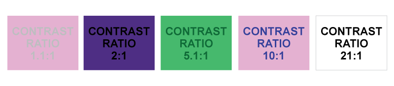
Have you ever read an email where the person who composed the email used a blue background and say, tiny 6 pt red text? Do you recall the burning sensation in your retinas and the looming migraine from staring at it too long? This is a prime example of a bad color ratio. Those with colorblindness will not notice the jarring red on blue, but they will notice how difficult the text is to read due to the low contrast ratio combined with small text.
Relying on a single color alone for links/buttons/calls to action also poses some problems when trying to convey a meaning. Combining color and pattern can yield much better results across the board when color alone would not be enough.
WCAG 2.0 guidelines point to a 1.4.3 ratio with text that is less than 18 point, so basically most things besides headers. Large scale text? A minimum of 3:1 is required.
If you want to be sure your typography passes, check out our free WCAG Color Contrast Tool.
Design Structure
The structure and layout of more complex pages certainly can play a role. For those using screen readers, it is of the utmost importance that the content is structured in an intelligent and fluent way. Some key tips for designing with structure in mind:
- Group similar elements (buttons such as confirm/cancel).
- Use primary headings (h1) for the title of the website/page only.
- Use headings properly to organize your content. Skipping heading levels (h2 to an h4 for example) can cause confusion with screen readers interpreting it as missing content.
Designing Labels with Accessibility in Mind
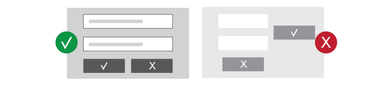
Accessibility relies on text that is instructive to a task, such as filling out a form. These labels may tend to clutter a layout slightl,y but are actually crucial to some users. A dropdown box without context is worthless to anyone, but giving a user all the necessary information helps everyone.
An important piece of this is in the field IDs added in the HTML, which are the most descriptive bits of information for the task read by a screen reader. This is not to say clear visual labels are to be ignored. Creating an easy-to-understand form for all users should be a priority.
HTML5 also supports placeholder text, which allows text to be added in the field as a hint. For instance, a form field asking for your “favorite movie” could have a placeholder that reads “The Wizard of Oz,” which serves as an easy-to-understand example.
Check out this video from user Mike Westorg on YouTube for some great examples.
MIKE WEST >> Hello, Internet!
Welcome to Web Accessibility.
Over the next few minutes, I’d like to explain why form elements require labels. Let’s dive right in.
If I give you an arbitrary “input” element of type “text,” you don’t actually have enough
information to determine what you should start typing.
Even if you know that the form in which the element lives is requesting a mailing address,
it’s difficult to guess as to whether a specific field is requesting your name, your street address, your zip code, or something else entirely.
You need some additional context. Visually, we solve this problem via layout, and by positioning textual labels next to the form fields. I see “name” next to the field, so I know I should type my name. Users who can’t see the label, however, are apt to be confused.
Let’s take a look at a naïve implementation of this labeling and determine how we can improve it. What we have here is a name (label), and an input field. If we run this through a screen reader, let’s see how it sounds.
CHROMEVOX >> Edit text.
MIKE WEST >> “Edit text.”
That doesn’t actually give me any context. It doesn’t give me information that I would need in order to figure out what it is that I should start typing here. We have, however, this label, and it would be great if we could somehow semantically bind this text to the field.
In fact, HTML allows us to do exactly that with the “label” element.
The first thing we’re going to need to do is uniquely identify this input field so that we can say “Label X is associated with input field Y.” We do that with an ID. Great.
So now the input field has an ID, and we can use that ID to label it. We’ll use the “label” element, and set a “for” attribute that contains the same value as the ID that we’ve just set.
Alright. Let’s run this through a screen reader, and see how it sounds.
CHROMEVOX >> [Beep] Name. Edit text.
MIKE WEST >> “Name. Edit text.”
That’s excellent! That gives us the context that we need in order to start doing something useful with this form field.
If we want to give them even more information, for example, a, an example of text that I should type here, we can use the placeholder” attribute, which is gaining support. It’s part of HTML5, it’s not yet supported by all screen readers, but most assistive technology will pick it up at some point in the near future.
Setting a “placeholder” [attribute] gives me some visual feedback that there’s something interesting about this field. It gives me a hint as to what it is that I should start typing.
A screen reader like ChromeVox understands this, and will read it out to a user. Let’s see how that sounds.
CHROMEVOX >> [Beep] Name. With hint. First and last name. Edit text.
MIKE WEST >> “Name. With hint. First and last name. Edit text.
So it tells me that I’m in an edit field, that it has a label of “Name” and that I should type both my first and last name.This is perfect. For further discussion of accessibility on the web, come visit us, at W15Y.com
Complex Features
Tabbed lists and accordion menus are everywhere in modern web design, but are they good for everyone? These more complex content areas pose some obstacles for screen readers and keyboard accessibility by adding a substantial amount of complexity to what is really simple content at times. Just take the time to consider if the content you have is absolutely needed in tabs or an accordion.
Another tricky website feature that is incredibly popular is the homepage slideshow. Slideshows can raise several red flags:
- Improper contrast ratio on items such as type, next/back buttons, and navigation buttons.
- Lack of a pause feature and visible controls in general.
- Keyboard accessibility issues (slideshow skipped entirely in some cases).
- Lack of focus order.

Clearly, there is a lot of work needed to make slideshows enjoyable for everyone. Keeping in mind the content of the slideshow, it may be wise to consider alternatives that cut back on unnecessary complexity.
It all comes down to common sense for the most part. Being aware of who you are designing for and their potential obstacles should be addressed early on in the web design process. The design can still be top-notch with just a little more consideration for everyone who will be using it.