A Quick Guide to WCAG Color Contrast and Accessibility
When building accessible digital experiences, color contrast plays a crucial role in ensuring conformance to the Web Content Accessibility Guidelines (WCAG).
Using a WCAG color contrast checker, such as Accessible Web’s Helper Chrome Extension, ensures your designs meet compliance and remain usable for everyone, including people with low vision or color blindness. Plus, it’s also good design sense.
What is Color Contrast?
Briefly, color contrast is the difference in brightness between colors in a design. If the contrast is high, the content is easier to read for everyone.
Designers generally intuit this, but sometimes trends or other preferences can override this instinct. That’s where accessibility rules can make the case. Text color contrast should typically have a minimum contrast ratio of 4.5:1.
Let’s break that down:
- There are two numbers, 4.5 and 1. These represent two colors. Any colors!
- 4.5 means that the lighter color is four and a half times brighter than the darker color, the 1.
For example, if you have a black and white design scheme, you will have a 21:1 contrast ratio. The background or foreground can be black, as long as the other color is white, that contrast ratio will still be 21:1.
How to Use Accessible Web’s WCAG Color Contrast Checker
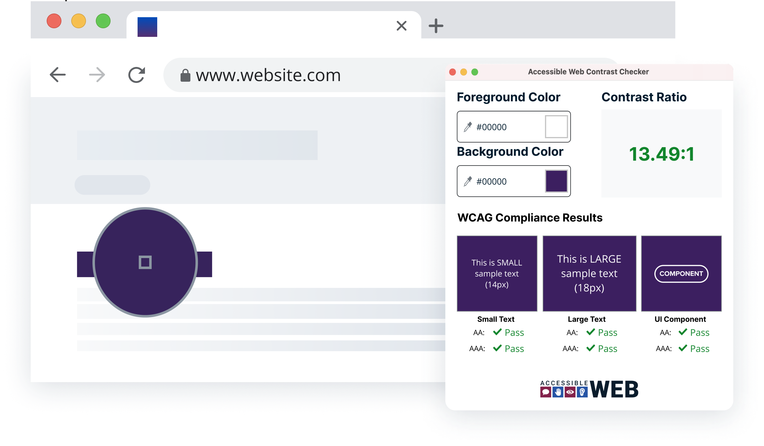
If you want to test this out, go ahead and open up our free color contrast checker. Or download the free Chrome Extension for more flexibility to test colors on any page or external windows.
If you know the hex code, the six-digit combination representing digital color, go ahead and pop them into the foreground and background color inputs.
Otherwise, you can use the color picker, displayed as an eyedropper tool in the color input element, and hover over the color you’d like to select.
WCAG Conformance Results
After selecting two colors, you should see your contrast ratio. If it’s above 4.5:1, it’s a pass. Of course, if it’s below, you should work on creating a better contrast.
However, there are three columns to go through with a few caveats. Small text requires a higher 4.5:1 contrast. However, larger text (24px) and UI components can have a lower contrast ratio of 3:1. To future-proof and create a better experience for everyone, we still recommend aiming for a minimum color contrast of 4.5:1. Read on for a few more frequently asked questions.
Color and Contrast FAQs
Inspired by our recent webinar, we wanted to dive into some frequently asked questions around color contrast.
What is a good colorblind-safe color for hyperlinks besides blue?
Deep purples, teals, or oranges often test well. Always verify with a WCAG contrast checker to ensure at least a 4.5:1 ratio against the background. However, it’s also essential to make sure there is another link marker for users who have color blindness; underlines do the trick nicely.
Do logos need to meet the 4.5:1 contrast ratio? Logos and brand marks are technically exempt from WCAG contrast requirements, but it’s still a good idea to create branding that meets these requirements.
Dark vs. Light Themes
WCAG does not require both themes, but whichever you implement must meet the contrast ratio. If using both, dark mode must still follow 4.5:1 for text and 3:1 for text larger than 24px and UI components such as buttons.
What is the minimum font size for responsive webpages? Does 14px meet WCAG 2.1?
WCAG does not set a specific minimum font size. Instead, text must be resizable up to 200% without loss of content or functionality. However, most accessibility experts recommend at least 16px for body text.
What about APCA (Advanced Perceptual Contrast Algorithm)?
APCA is a newer contrast model being considered for WCAG 3. It better reflects how humans perceive light and contrast on modern displays, moving beyond the fixed 4.5:1 ratio. While not yet a requirement, it’s worth testing as adoption grows.
Color Contrast Takeaways
Color contrast isn’t just a compliance checkbox; it’s a critical part of accessible and inclusive design.
Use tools like the Accessible Web Helper to validate your color contrast work and stay ahead as standards evolve.