Our free contrast checker calculates contrast ratios as accurately as possible. However, please be aware that some color combinations might still fail overall due to other visually related factors such as hover/focus states animated effects, etc.
Required Contrast Ratios for WCAG Conformance
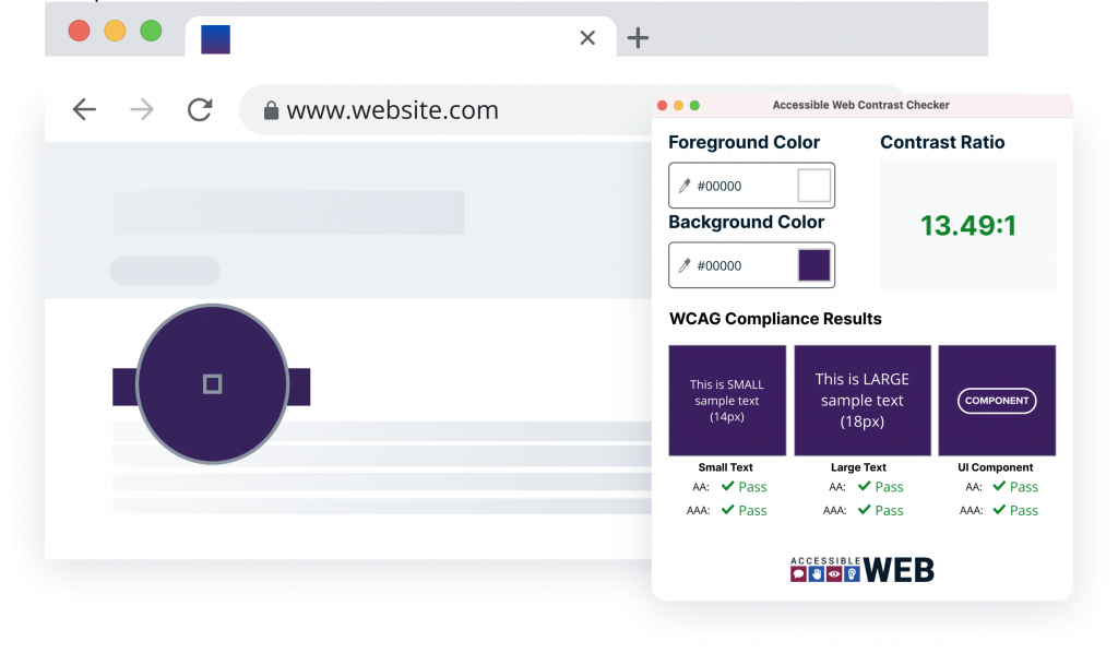
Level AA – Text
4.5:1 for regular text and 3:1 for large text (18 pt or 14 pt + bold).
Level AA – Non-Text
3:1 for UI components & graphics.
Level AAA – Text
7:1 for regular text and 4.5:1 for large text (18 pt or 14 pt + bold).
Your All-In-One Web Accessibility Testing Software
Check Web Pages
Accessible Web Helper provides web accessibility tools in your browser, including scanning website pages for WCAG failures, highlighting violations, checking the contrast ratio of elements on the page, and more.

Scan & Fix Full Websites
Sign up for a free trial of Accessible Web RAMP to access our full suite of tools and support, empowering your team to make rapid progress on improving your website accessibility.
More Free Resources and Tools

Website Accessibility Checker
Scan websites to discover accessibility issues.

Accessibility Statement Generator
Show the world that you’re dedicated to making your website accessible.

WCAG Knowledge Base
Ask our experts any accessibility question and browse through answered topics.
FAQ
-
Color contrast is the difference in brightness between colors. A high contrast makes content easier to read for everyone.
-
Color contrast plays a crucial role in accessible digital experiences by ensuring conformance to WCAG. It is essential for usability, making content easier to perceive for everyone, especially for people with low vision or color blindness.
-
You can check color contrast using this WCAG color contrast checker or the Accessible Web Helper Chrome Extension. These tools allow you to input the hex codes (the six-digit combination representing the color) for the foreground and background colors, or use the color picker tool to select the colors directly from a page or component.
-
A black and white design scheme creates the highest possible contrast ratio, which is 21:1. For regular text, the WCAG typically require a minimum contrast ratio of 4.5:1. This ratio means the lighter color is at least four and a half times brighter than the darker color.
-
To use a checker, you input the hex codes or use the color picker to select the foreground and background colors. The checker automatically determines and displays the contrast ratio for the two colors and whether it passes or fails. Keep in mind this can be different for different-sized texts, and a higher ratio is recommended where possible!
-
Regular text color contrast should have a minimum contrast ratio of 4.5:1.
Let’s break that down: There are two numbers, 4.5 and 1. These represent two colors. 4.5 means that the lighter color is four and a half times brighter than the darker color, the 1. For example, if you have a black and white design scheme, you will have a 21:1 contrast ratio, that’s 21 times brighter.